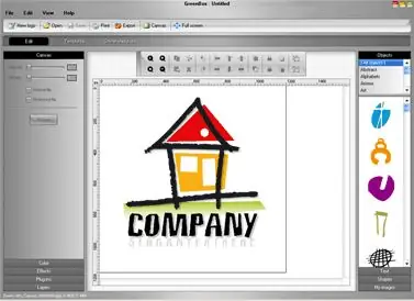
No firm and company can exist without an original logo - after all, the logo is a kind of company face, its corporate symbol, and distinguishes the company from many similar organizations. The manner in which the logo is executed largely determines its subsequent perception by both the management of the company and its customers. The logo should be both laconic and iconic, it should contain a stylized, memorable and recognizable symbol that will become associated with the company, giving it a certain atmosphere. Use Adobe Illustrator to draw the logo.

Instructions
Step 1
First, choose a shape, symbol or object that you will take as the basis of the logo - it can be either a letter, which you then stylize, or some kind of animal, or any other object. You can make any object look like a logo by transforming it into a graphic outline drawing.
Step 2
To get started, take the original image you will be making your logo on and load it into a new Illustrator document as a template. To do this, select the Place section from the File menu, click on Image Name, and then on the Check Template box. Your image will move to a new layer, closed from changes, the opacity of which is set to 50%.
Step 3
Create a new layer and double click to rename it. On the created layer, using the Pen Tool (Pen), carefully trace the object on the template layer. Repeat all the bends with the contours of the feather, adjusting the resulting silhouette with nodes, guiding the vectors manually where they did not fit correctly.
Step 4
On this layer, you need to outline the main outline of the object without affecting additional details. For details, create another layer and give it a different name. Trace the individual pieces of the drawing attached to its main silhouette, which you outlined on the previous layer.
Step 5
Now paint all the objects black using the fill tool. This will help you see the outline of the drawing more clearly. Using the Direct Select parameter, adjust more precisely and thinly the lines of the image, remove excess and add small details, if necessary. To avoid accidentally changing the layers below, lock them while editing the active layer.
Step 6
Create a new layer with a new name to paint the cut. Draw again with the pen all the outlines and silhouettes of the shape, just as you did on the previous layers, but use for this not black, but white.
Step 7
Then apply a white fill to the shape. Refine the logo - it has already acquired a black and white graphic look, and all you need to do is make the contours and silhouette of the logo more graceful and elegant, draw the details and place the logo next to the name of the company to see how well they fit together.


