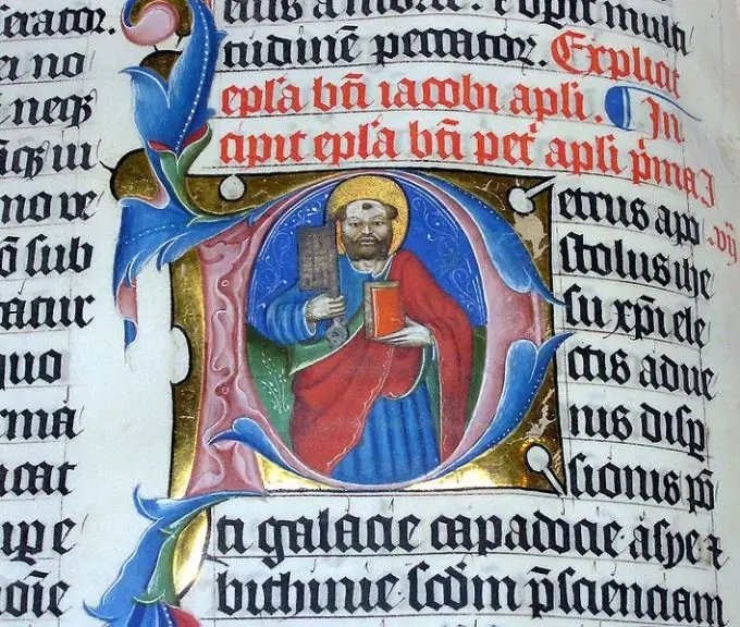
The first letter of the first paragraph of a work or its separate chapter, if it is enlarged and artistically designed, is called a drop cap. And how exactly to arrange it depends only on the artist's imagination.

Instructions
Step 1
To design a drop cap, you can use both a computer with a graphic editor and traditional artist tools: pencil, felt-tip pens, paints, etc. In the second case, to transfer the result to a computer and then insert it into the text, use a scanner or a high-quality digital camera. Insert a letter so that it spans one quarter to one third of the paragraph width and five to ten lines.
Step 2
First, draw the outline of a drop cap with a pencil, following the pattern of the same letter from a particular font. It must be capitalized. If the result is supposed to be scanned or photographed, draw on the whole sheet - this is more convenient to work out the details. Then the picture can always be reduced to the desired size.
Step 3
After drawing and correcting the path, stroke it with a brush or felt-tip pen. It is not necessary to strive for great contrast - you can take not black, but gray, blue or green. If the letter is taken from a serif (serif) font, you can add additional curls to them using ink and a thin poster pen (and in a graphics editor - by reducing the diameter of a virtual brush or pencil).
Step 4
Now start filling in the inner space of the letter. You can fill it evenly with one color or one texture or another. But a more interesting artistic effect will be obtained if the drop cap is divided into two halves with an imaginary horizontal line located in the middle. The top half should always be lighter than the bottom. You can, for example, make the upper part of the letter white, yellow or light gray, and fill the lower one with horizontal stripes - this effect is found in many drop caps.
Step 5
Give the letter volume. To do this, draw equal diagonal lines from each point of the outer contour with a thin pencil. Connect the opposite ends of these segments together. Then connect those parts of this line that will be visible with a brush or felt-tip pen. Paint the walls of the letter the same color as the outline.
Step 6
Finish the drawing by adding a background to it. You can pre-draw an object plane behind the drop cap, but this is not necessary. The background color can be any, the main thing is that it is darker than the top of the drop cap, divided in half, but lighter than the bottom. If the letter is not split, the background may be slightly lighter or slightly darker than the inner space of the letter. When using the object plane, the hatching above the dividing line should be vertical, and below it - horizontal.


