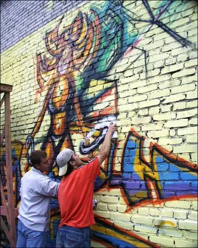
Graffiti may well claim to be a special kind of fine art. Transferring energy in line and color is not so easy, especially if you only have an uneven wall surface and a couple of cans of paint at your disposal. The graffiti font differs significantly from other fonts, it is based not only on letters, but on thoughtful joints and compositions.

Instructions
Step 1
Start with simple block letters, then gradually move on to more complex styles and shapes. At the initial stage, do not try to portray a complex heaped font wide or 3D, because due to the lack of skill it turns out not very much, with a bunch of mistakes and shortcomings.
Step 2
Choose a word. In order to depict the font, write in simple block letters. Next, try to write the same word no longer in simple lines, but in separate forms. Make sure that the lines are parallel along their entire length and at the same distance. The thickness of the individual parts of the letters must be the same. Respect the proportions of the letters. Do not try to change the size and thickness of the letters at the initial stage (it still won't work perfectly). Draw individual elements intertwining with each other, then remove the extra lines and circle the main ones. This will give you the correct letters.
Step 3
After you have sketched and honed individual letters, try to assemble them into a font, i.e. composition consisting of letters. At the initial stage, plan the shape of this composition balanced, correct and beautiful. The simplest and most common shape is a rectangle, when letters are sequentially inscribed into it at an equal distance from one another and at the same height from the horizon. Decide on the location of the font. It can be either in the air or go to the floor or to the right, left, top edge of the canvas. Thus, you form your composition as a whole and each letter separately.
Step 4
After practicing with simple letter shapes, try more complex ones by using additional elements (arrows, shapes, etc.) to create connections between letters. Do not overlay too many elements that change the shape of the letters beyond recognition. After all, letters are the basis of a font, and additional forms are secondary.


